

Real Projects. Real Experience. Real Impact.
At WPI, you’ll engage in hands-on collaborative projects from day one.


Pursue Your Passion
Robbie Oleynick ’24 integrates tech with music in the theatre

Innovation & Entrepreneurship
Freedom to innovate, the tools to create, and the support to make it happen

Find Your Niche


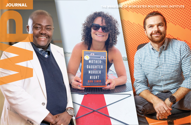
Features from the WPI Journal
See how DraftKings co-founder Paul Liberman ’05 built a gaming empire with an engineering mindset; why Gabriela Hoops ’19 was closely watching last summer’s 2023 Women’s World Cup in Australia; and how Professor Jamal Yagoobi is working with industry to address energy-hogging drying technology on the manufacturing floor. In addition, read about adaptive golfer Doug Shirakura ’24 and his quest to inspire; and the plot twist that had Nina Simon ’03 pivoting from global nonprofit CEO to bestselling mystery author.